Once children are familiar with air pollutants, and what air quality data looks like, they could carry out their own investigations. For example:
- What is the most polluted day / the cleanest day in one of the capital cities?
- How do levels of air pollutants compare in different cities?
- How do levels of air pollutants vary from month to month, or year to year?
- How did the levels of air pollutants vary during the 2020 lockdowns compared with previous years?
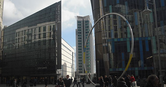
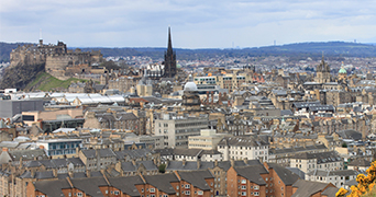
To help teachers and children explore these questions, we have created pre-prepared data sets (see zipped files below). There are spreadsheets, for the four capital cities of the home nations (Belfast, Cardiff, Edinburgh and London) and for a clean air site (Auchencorth Moss, Scotland). We have taken data for the years 2010, 2012, 2014, 2016, 2018 and 2020. Only data on the main atmospheric pollutants have been extracted (nitrogen dioxide, nitric oxide, carbon monoxide, sulfur dioxide, PM2.5 and PM10).
Note: Each Air Quality Datasheet shows some of the raw data. The data was extracted from the Air Quality Archive (2010-2018 obtained 30-31 March 2020, 2020 obtained March 2021).
You will also find examples of graphs within some of the data sheets showing a few of the many possible ways of looking at the information:
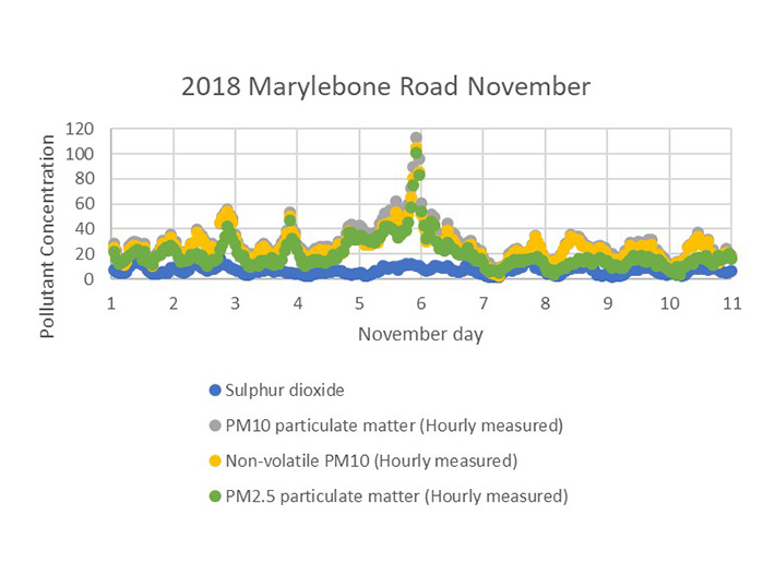
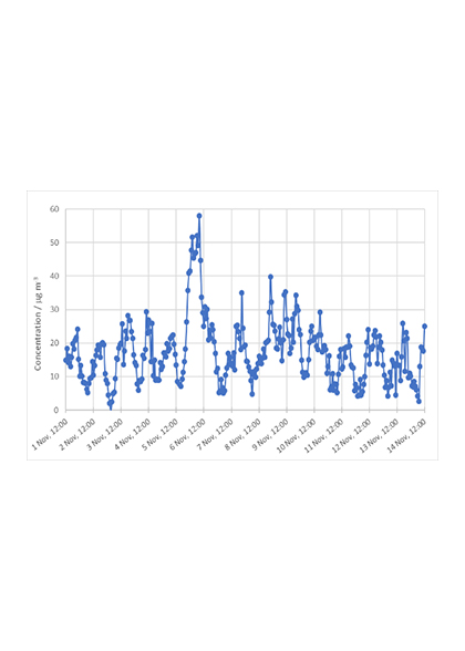
- London (Marylebone Road) 2012 (London Olympics Year) – each major pollutant is reproduced on successive sheets. On each sheet an average per month was calculated so that subsequent ‘rough’ plots of both yearly and monthly data could be generated. (‘Rough’, because the axes were not titled, no units were given (apart from in the legend) and an inaccurate graph title was used.) The type of plot you might want to use is up to you. On the particulates PM2.5 sheet, the daily average hourly data for the year (days numbered rather than dates given) was plotted, as was the monthly average.
- Cardiff 2018 – yearly graphs of air pollutants PM2.5 and PM10 are presented as daily levels and average monthly levels for comparison of clarity.
- Edinburgh 2018 – air pollutants and PM2.5/10 graphs are produced for August, November, and December, for identifying trends across different months.
- Belfast 2018 – air pollutant and PM2.5/10 fortnightly data tables, for plotting data.
- Covid-19 lockdowns 2020 – some graphs are provided for all sites. Students may be interested to investigate the levels of air pollutants during the Covid-19 lockdowns 1, 2 or 3.

